Out of Print
The Character of Jo Malinis
by Toni Potenciano
Portraits by Petra Gana
Special thanks to the U.P. Fine Arts Department
Does being a creative in the Philippines have to be so hard? For teacher and type designer Jo Malinis, nothing will stop her from doing something about it.
The catch is, the conference isn’t exactly free. Each student would have to pay 100 USD upfront just to attend. As students of the University of the Philippines (a public institution), the attendance fee alone would already be pretty steep. What more the hefty miscellaneous costs like flights, accommodations, meals, and wretched visa applications? It’s not like the university was going to offer any assistance either, Jo said. Surely the organizers could give some relief for the attendees from the Philippines.
“Masyadong labag sa kalooban ‘yung 100 USD per student. So I said, either tuloy niyo ‘to na ako lang or ‘wag na.” she says. “In the end, they just uninvited me.”
“How do you feel?” I ask, even if I know the answer. I was there when she first got the invite to speak at the conference. It felt like one of those opportunities you’d be a fool to pass up. The kind that could perhaps change the course of one’s design career. Jo’s story is a common one in the industry—the inevitable result when the Global North expects those from the Global South to keep up with their level of innovation and investment in terms of time, labor, and money when it comes to design. Just how many people do we know who have had to give up lucrative opportunities abroad just because they couldn’t afford it?
“At first I felt nothing. And then after everything, nakakagalit pala siya,” Jo says.
︎
Jo has had a good year, one full of recognition for all the work she’s put in ever since she became a designer. She completed her course at Type West, one of the few postgraduate programs dedicated to type design in the United States. She was one of the headliners at Graphika Manila 2023, where she got to talk about her work as a teacher and about Type63, the platform she started that celebrates and showcases Filipino type design and typography. Face-to-face classes have finally begun at the university, which means she’s seeing her students for the first time ever. It’s also been a whole year since she’s gone full freelance after leaving her first job at Plus63.“Congratulations,” I tell her, as we cruise down the Tarlac-Pangasinan-La Union Expressway. We’re hours away from Manila, returning home from a Baguio vacation that felt a little more like a work-slash-staycation, where we spent at least half of the time in front of our laptops.
“Thanks,” she says a little uncomfortably. A common reaction among overworked millennial women who are unable to accept praise. Even after all she’s done, type school and career milestones notwithstanding, Jo can’t exactly pinpoint what’s changed or how she’s grown as a designer.
“Ewan!” she exclaims. Surely you feel more skilled? I prod. “Maybe, but honestly, halos pareho pa rin. I’m still unsure of what to do even if nag-aral ka na at ang dami mo nang alam,” Jo says. “If anything, nabawasan lang ‘yung uncertainty ko, pero nandyan pa rin. I guess the uncertainty is just not crippling anymore—that’s the difference.”
It’s a smooth and scenic drive. Anyone who’s ever been on the TPLEX would know there really is nowhere to go but on. The young rice fields ablaze by the glow of the setting sun, a few weeks away from the summer harvest. Here, where work emails can’t reach us, we talk about her career as a designer and a teacher, and where she thinks she’s headed next.
 Yor mood board for Type West
 Graphika Manila 2023
Jo talks assuredly about her past. Ever since she was young, she knew that she wanted to teach and design. No doubts or second guesses. Everything in her life at that point led to these two things.
She grew up with creative parents, which was what eventually led to her pursuing a degree in Fine Arts. Her father was a graphic artist while her mother was an editor. They met at the previously government-owned Instructional Materials Corporation, which was created in 1982 to make textbooks and learning materials for public and secondary schools.
After leaving the company, Jo’s parents put up what she calls “their own version of a design studio,” called Deskarte in Teacher’s Village, Quezon City, a two-person firm where they took up print and design jobs like manuscripts and textbooks. Jo’s mother would do the editorial work while her father designed and laid out the text.
“I would sit down beside [my dad]. Manunuod lang ako sa kanya mag-layout sa Adobe PageMaker. Because we didn’t grow up with a yaya or help at home, diretso kami ni Janina [Jo’s sister] doon sa business. We would just sit there and play. Titingin lang kami sa kanila, tapos uuwi na kami.”
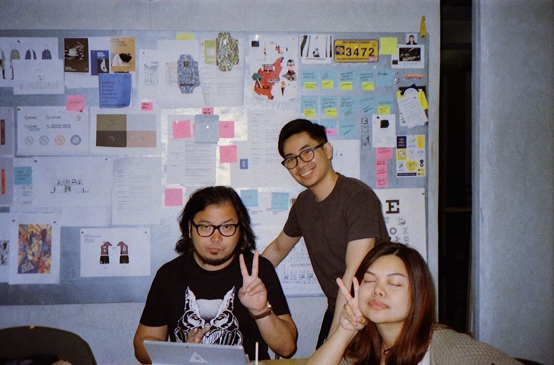
When she graduated with Latin honors, Jo felt she was more or less set for life. She was on track to work for one of the bigger advertising agencies in the country, where she would eventually climb the arduous corporate ladder to become an art director. “It was just the job everyone wanted at the time,” she explains. However, a curveball arrived in the form of a job offer from a small design studio called Plus63, founded by multi-awarded designer and illustrator Dan Matutina.
She grew up with creative parents, which was what eventually led to her pursuing a degree in Fine Arts. Her father was a graphic artist while her mother was an editor. They met at the previously government-owned Instructional Materials Corporation, which was created in 1982 to make textbooks and learning materials for public and secondary schools.
After leaving the company, Jo’s parents put up what she calls “their own version of a design studio,” called Deskarte in Teacher’s Village, Quezon City, a two-person firm where they took up print and design jobs like manuscripts and textbooks. Jo’s mother would do the editorial work while her father designed and laid out the text.
“I would sit down beside [my dad]. Manunuod lang ako sa kanya mag-layout sa Adobe PageMaker. Because we didn’t grow up with a yaya or help at home, diretso kami ni Janina [Jo’s sister] doon sa business. We would just sit there and play. Titingin lang kami sa kanila, tapos uuwi na kami.”
When she graduated with Latin honors, Jo felt she was more or less set for life. She was on track to work for one of the bigger advertising agencies in the country, where she would eventually climb the arduous corporate ladder to become an art director. “It was just the job everyone wanted at the time,” she explains. However, a curveball arrived in the form of a job offer from a small design studio called Plus63, founded by multi-awarded designer and illustrator Dan Matutina.
“Design studios weren’t really a thing back then and I didn’t even know who Dan Matutina was outside of UP,” Jo recalls.
 Photos courtesy of Jo Malinis and Plus 63 Design Co.
Jo impressed Plus63 co-founder Berns Yumul, who was a panelist during her thesis. Their offer was generous and non-binding, far from the norm of most employee contracts. “They said I could leave after three months if I wanted to continue with advertising. But if I’d like to stay, they would want me to stay,” Jo says.
“Did the offer from the advertising agency ever come?” I ask.
“No. Because when I accepted the job at Plus63, I told the advertising agency that I took the job already while waiting. I just wanted to let them know as a courtesy. That was when the creative director called to tell me that I was throwing away an opportunity with them. Throwing away a career.”
At first, Jo was a little ashamed. Her college friends at that point were all in their respective advertising agency jobs in the busier financial districts of Metro Manila, while Jo was in a shoebox studio office in Quezon City. “My press release was that I’d stay in this small design studio first just for the time being to earn some money, then I will transfer to advertising,” she recalls.
“But I guess the mentorship of Dan and Berns is really what got me to stay. Iba talaga eh. After that, I fell in love with design. Tuloy-tuloy na from there.” Jo ended up staying in Plus63 for nearly a decade.
Type wasn’t part of Jo’s plans, but it was what made the most sense in her trajectory as a designer. Dan observed that Jo had a way with designing logotypes. All her letters and forms were technically-driven, meticulous, and elegant. So he challenged her: why not make an entire typeface for a brand?
“I thought, ginagawa pala ‘yon? Gumagawa ng custom font?” Jo says, recalling her first typeface project. Most branding projects require one to work with type to a certain extent. You might set a couple of fonts for consistency or maybe even develop a custom logotype. But designing an entire usable font is a wholly different matter. It requires different programs and learning how to use them. It requires a lot more time, work, and a literal commitment to the bit—a consistent and cohesive design style to be applied to all your characters from A to Z, 1 to 9, and all the glyphs in between.
Type is a broad field within graphic design. There are nuances when you talk about type, typefaces, and fonts. The words you see on a screen can be broadly defined as type, but once we start talking about a complete set of characters and the look and style that unites them—that’s a typeface.
Contemporary type design and typography has always been more popular and accessible in the West. That’s why more developed countries are home to stronger type foundries. Even when printing presses had to downsize or close, type foundries found a renaissance in the digitized reissues of some of the most iconic typefaces such as Arial and Times New Roman by Monotype in Pennsylvania; the Swiss Helvetica by Linotype; and a version of Futura which was redone by the Moscow-based Paratype.
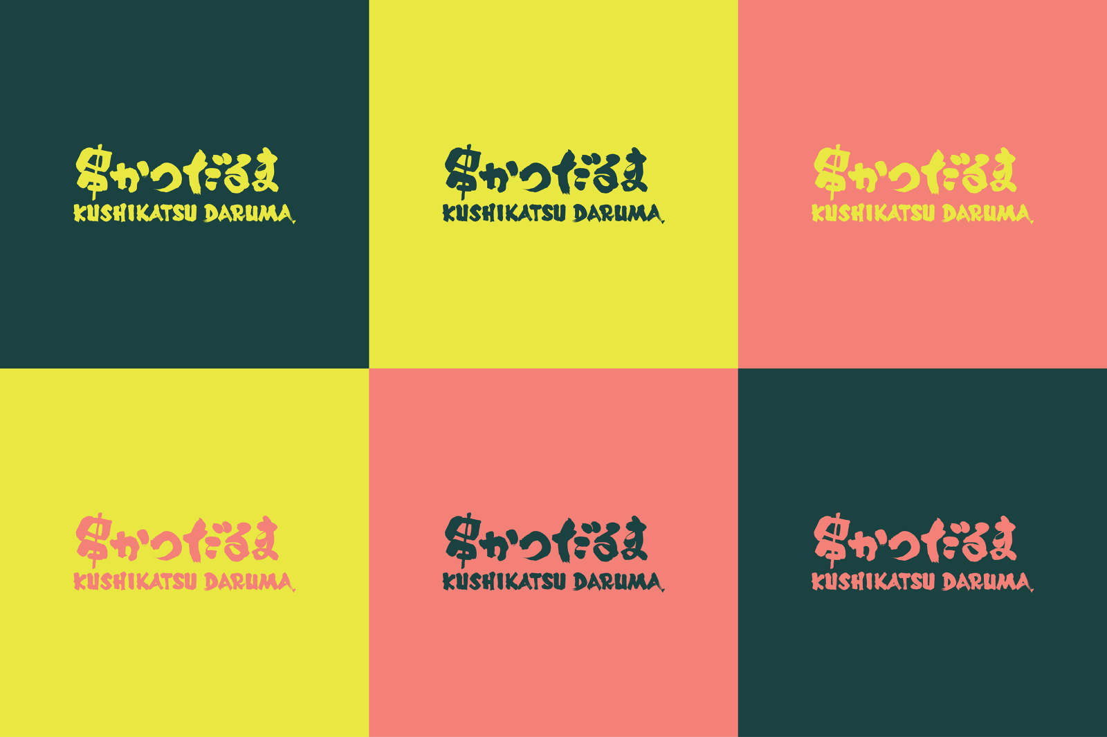
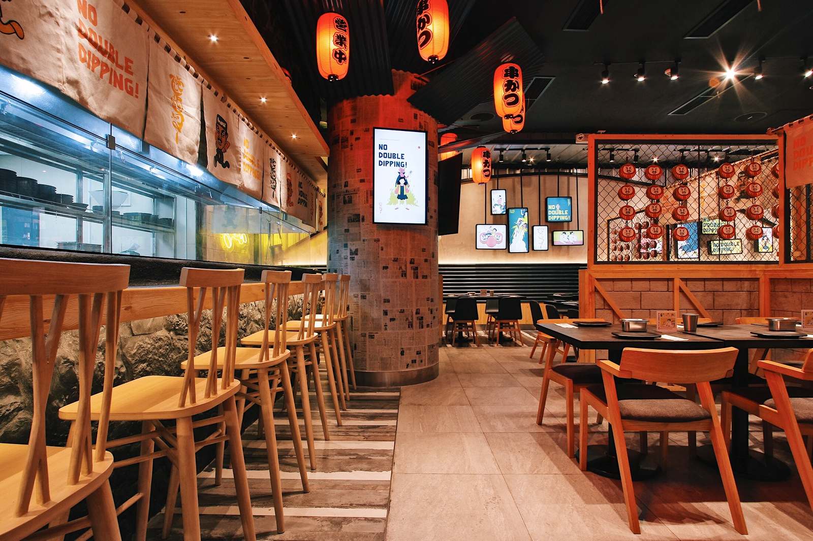
Daruma Sans, a custom sans serif based on the logo of Kushikatsu Daruma, a kushikatsu / kushiyage shop from Osaka, Japan. Photos courtesy of Plus 63 Design Co.
“It obviously wasn’t taught while I was in school, pero walang kahit YouTube tutorial about creating a typeface,” Jo says.
It’s an industry with huge economic potential that’s largely been contained in the West and the Global North. Which is why it’s unsurprising that resources on how to develop typefaces back then, let alone anything from local designers, were scant. “It obviously wasn’t taught while I was in school, pero walang kahit YouTube tutorial about creating a typeface,” Jo says.
Compared to illustrators, type designers fly largely under the radar. When you see a great font, your first instinct might be to use it, not find out who made it. When Jo was starting out in type, she sought out other local type designers. While there were a lot of designers who participated in challenges like the famous 36 Days of Type, there were only a handful of designers who had made actual fonts. Such included Andrew Paglinawan, who made the free display san serif called Quicksand in 2008, Aaron Amar with Quiapo Free in 2018, and John David Maza with Maragsa in 2020. But Jo was convinced they weren’t the only ones.
Compared to illustrators, type designers fly largely under the radar. When you see a great font, your first instinct might be to use it, not find out who made it. When Jo was starting out in type, she sought out other local type designers. While there were a lot of designers who participated in challenges like the famous 36 Days of Type, there were only a handful of designers who had made actual fonts. Such included Andrew Paglinawan, who made the free display san serif called Quicksand in 2008, Aaron Amar with Quiapo Free in 2018, and John David Maza with Maragsa in 2020. But Jo was convinced they weren’t the only ones.
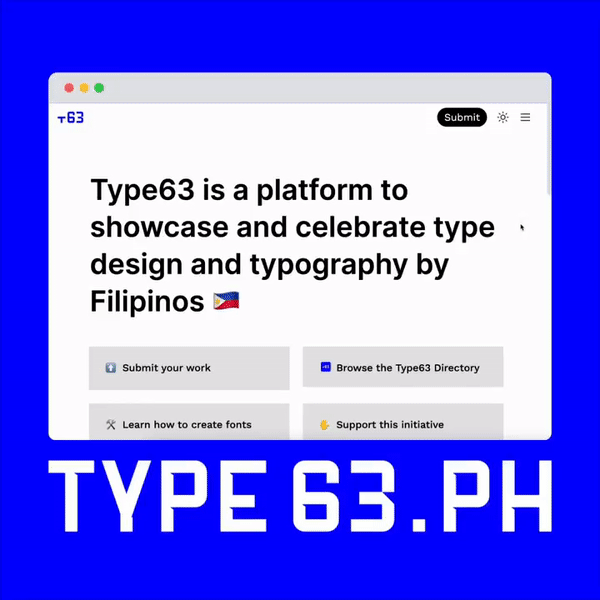
“There had to be more Filipino type designers, maybe just not in my immediate circle,” Jo says. This prompted her to start Type63, a free, online catalogue and platform for Filipino type design. To date, Type63 has nearly 100 Filipino type designers on its database. The Instagram account has more than 8,000 followers and over 400 posts that feature different type specimens, treatments, and fonts all made by Filipino designers.
She says that the response to Type63 is proof of interest in Filipino type. “We’ve identified the designers and we know there are people who want to support these designers, but where do we go next?” Jo tells me. “Not all of us have access to education. Ano’ng pwede natin gawin? I wanted to have an answer to that last year but I went into type school. Doon ko rin na-realize na hindi ako pwedeng mag-isa lang dito. It won’t go anywhere if it’s just me.”
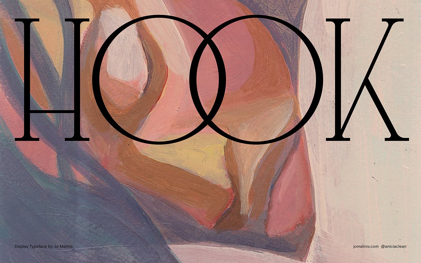
It took Jo an entire year to finish “Hook,” her first commercial typeface. Hook is a tall display serif typeface with subtle bends and swerving joints that takes its name from hooks in music—a total of 354 glyphs, several case sensitive forms, and stylistic alternatives. Post-release, Jo has slowly been updating the typeface by adding several weights like thin, semi-bold, and bold.
Designing Hook is what pushed Jo to seek mentorship, first with Alphabettes, a global network of female and nonbinary type designers. “There was just so much I didn’t know. A lot of the foundational stuff. It made me realize I need type education to make this work better for me in the future,” she says.
But working with non-Filipino mentors meant that Jo spent extra time explaining her context as a Filipino designer. “I always go back to this one experience with another mentor. When I released Hook, I asked how you price a font. She was suggesting that it shouldn’t go below Є60, which is expensive. I want people from the Philippines to be able to download it. So when I was trying to explain that to her, hindi niya fully maintindihan why I was trying to push for a lower price. I had to explain pa the context na hindi willing or walang budget magbayad ang clients dito for a font. Dito, hindi na natin kailangan mag-explain amongst ourselves.
She says that the response to Type63 is proof of interest in Filipino type. “We’ve identified the designers and we know there are people who want to support these designers, but where do we go next?” Jo tells me. “Not all of us have access to education. Ano’ng pwede natin gawin? I wanted to have an answer to that last year but I went into type school. Doon ko rin na-realize na hindi ako pwedeng mag-isa lang dito. It won’t go anywhere if it’s just me.”
︎
It took Jo an entire year to finish “Hook,” her first commercial typeface. Hook is a tall display serif typeface with subtle bends and swerving joints that takes its name from hooks in music—a total of 354 glyphs, several case sensitive forms, and stylistic alternatives. Post-release, Jo has slowly been updating the typeface by adding several weights like thin, semi-bold, and bold.
Designing Hook is what pushed Jo to seek mentorship, first with Alphabettes, a global network of female and nonbinary type designers. “There was just so much I didn’t know. A lot of the foundational stuff. It made me realize I need type education to make this work better for me in the future,” she says.
But working with non-Filipino mentors meant that Jo spent extra time explaining her context as a Filipino designer. “I always go back to this one experience with another mentor. When I released Hook, I asked how you price a font. She was suggesting that it shouldn’t go below Є60, which is expensive. I want people from the Philippines to be able to download it. So when I was trying to explain that to her, hindi niya fully maintindihan why I was trying to push for a lower price. I had to explain pa the context na hindi willing or walang budget magbayad ang clients dito for a font. Dito, hindi na natin kailangan mag-explain amongst ourselves.
Video courtesy of Type 63 PH
 Hook Typeface
In 2021, she sent in her official application to the year-long course of Type West. One of her classmates included designer John David “Jad” Maza, who described Jo’s presence and the moral support she provided as “heaven-sent.” Together they navigated the awkward time zones, staying up till 3:00 A.M. to attend class. “In case na medyo male-late, sa paggising man or pagpasa ng requirements, merong mangangamusta,” Jad writes.
Having another Filipino in class served as motivation for Jo. “We were Team Philippines. Hindi tayo pwedeng olats kasi may pinapatunayan tayo,” she says.
“Was there really a strong feeling to prove yourself to these people?”
“You want to prove to them that you can do it too. What’s funny is whenever we’d get pretty harsh critiques, it would fuel us to make our work so much better the next time around. We wanted to show them that that was nothing and that we can overcome that too in the same way you do. I don’t know where the competitiveness comes from. We can dive deeper into colonization or whatever, but I think ‘yun talaga ‘yun. You feel like people look down on you because you’re Filipino.”
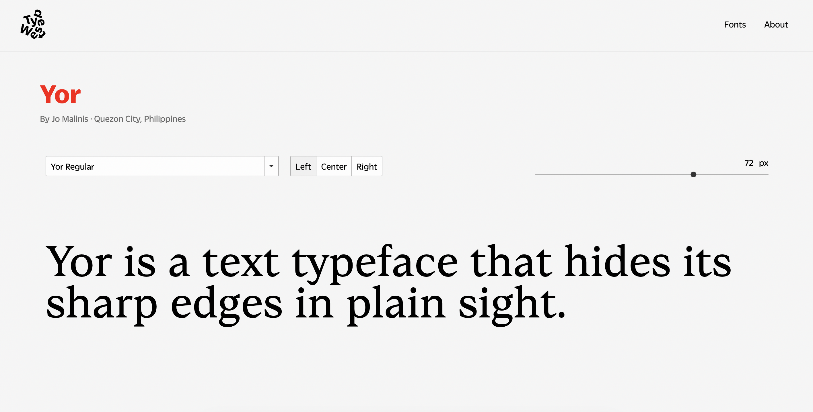
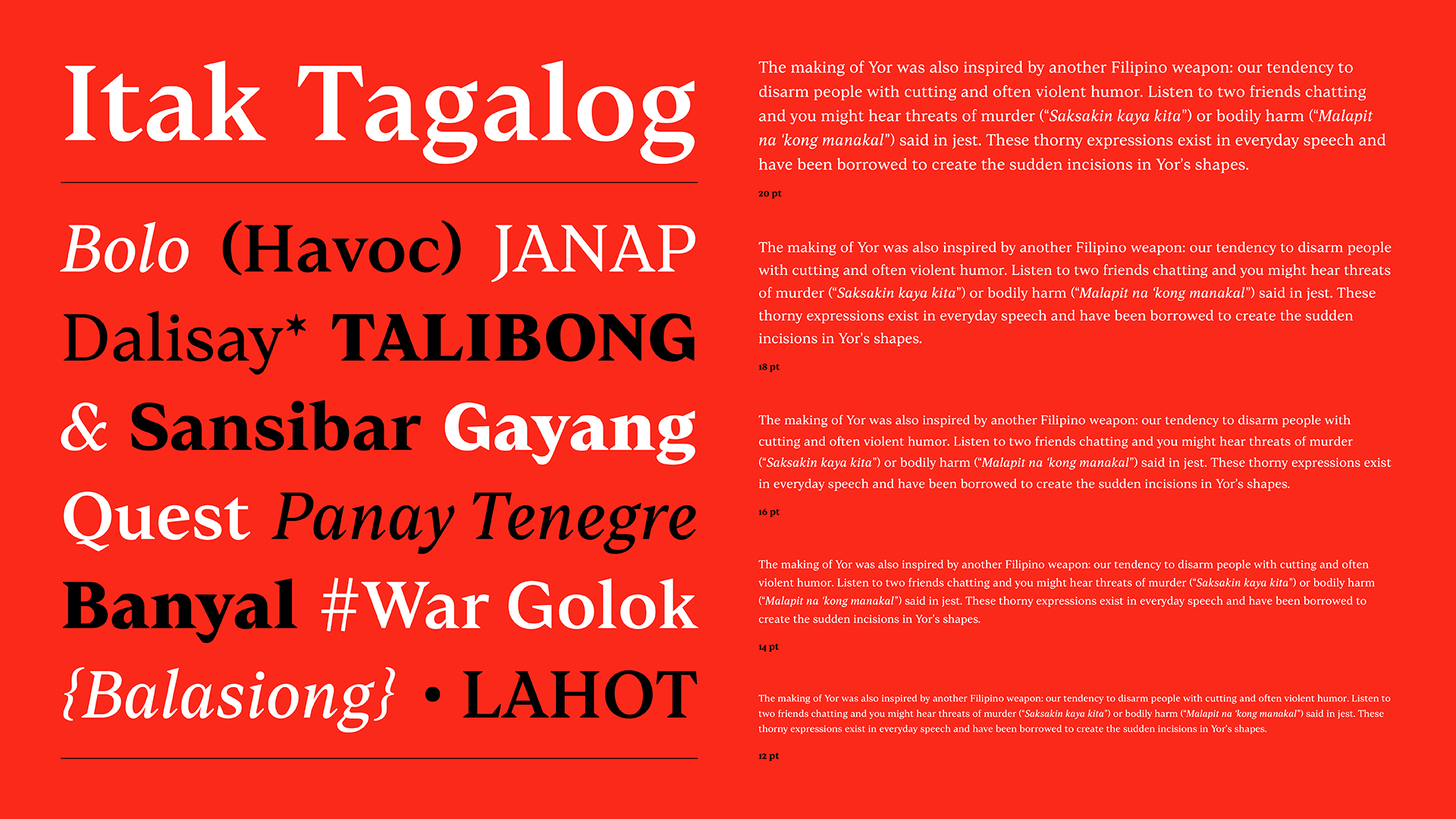
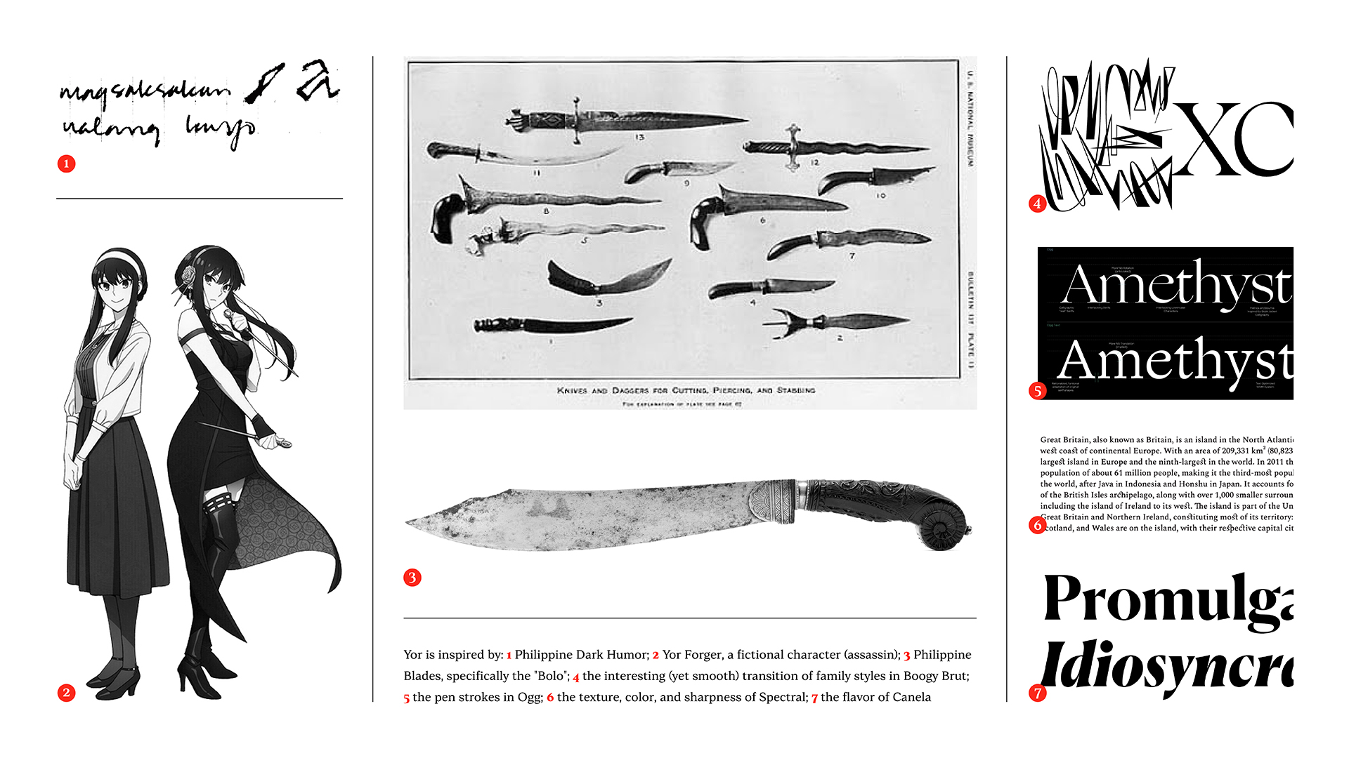
Her final plate for Type West was a typeface called Yor, a text typeface inspired by the undercover, knife-wielding assassin Yor Forger and the Filipino bolo, a blade with a curved front that tapers off abruptly into a straight edge at the back. “A perfectly functional typeface with a deceptive personality,” reads the description. Its inspiration is most evident in the typeface’s terminals, which are lopped off instead of having more “natural” looking cuts.
Beyond the anime reference and the bolo, Yor was also inspired by a conversation she had with friend and former Plus63 colleague Raxenne Maniquiz. “Naalala ko si Rax na kinwento niya, na noong bata pa sila, sinasabi ng nanay niya na, ‘O, ito kutsilyo, magsaksakan na lang kayo.’” A common threat used by exasperated Filipino mothers when the fights between children get too heated—context she couldn’t easily explain to her peers at Type West.
Having another Filipino in class served as motivation for Jo. “We were Team Philippines. Hindi tayo pwedeng olats kasi may pinapatunayan tayo,” she says.
“Was there really a strong feeling to prove yourself to these people?”
“You want to prove to them that you can do it too. What’s funny is whenever we’d get pretty harsh critiques, it would fuel us to make our work so much better the next time around. We wanted to show them that that was nothing and that we can overcome that too in the same way you do. I don’t know where the competitiveness comes from. We can dive deeper into colonization or whatever, but I think ‘yun talaga ‘yun. You feel like people look down on you because you’re Filipino.”
Her final plate for Type West was a typeface called Yor, a text typeface inspired by the undercover, knife-wielding assassin Yor Forger and the Filipino bolo, a blade with a curved front that tapers off abruptly into a straight edge at the back. “A perfectly functional typeface with a deceptive personality,” reads the description. Its inspiration is most evident in the typeface’s terminals, which are lopped off instead of having more “natural” looking cuts.
Beyond the anime reference and the bolo, Yor was also inspired by a conversation she had with friend and former Plus63 colleague Raxenne Maniquiz. “Naalala ko si Rax na kinwento niya, na noong bata pa sila, sinasabi ng nanay niya na, ‘O, ito kutsilyo, magsaksakan na lang kayo.’” A common threat used by exasperated Filipino mothers when the fights between children get too heated—context she couldn’t easily explain to her peers at Type West.
“We were Team Philippines. Hindi tayo pwedeng olats kasi may pinapatunayan tayo,” she says.
Jo calls teaching her “last job.” The job she’s always wanted and the one she’d like to do till she no longer can. The job she plans to stick with for the rest of her productive years. “Noong bata pa kami, mayroon akong table na maliit before na ‘pag in-open mo, may chalkboard,” Jo recalls. “I would get Janina and her friends to be my pretend students then mang-lelecture kami sa bahay. Psychopath daw ako sabi ni Janina.”
She started as a lecturer at the College of Fine Arts of UP Diliman in 2020, in the same program she graduated from. “Why did you want to be a teacher in the pandemic?” I ask.
“I just felt it was the time to say yes to something that I knew would help the college, if that makes sense,” she replies. Like any good teacher, she wants to give students what she didn’t have back then. Besides design, she teaches her students the practical and administrative part of holding down a creative job. She’s taught them how to draft cost estimates and basic contracts. She wants them to have a fighting chance when they get out of school. It goes without saying that she also teaches them the fundamentals of type.
“It’s not uncommon for students to not have their own equipment like laptops or the software for designing,” she tells me. “After all, UP is a public school, so I’ve written a couple of letters asking for help or student discounts for my students that need it.”
“But even without the equipment, we still make it work,” she says. “Even if they have to sketch their designs on paper, it’s fine with me.”
But the past months have been a trying time for Jo. “A real struggle,” she says. So much so that it’s made her question if she can actually do this for the rest of her life. “It’s not so much about my desire to teach, more than if it’s actually sustainable.”
It’s the compounded effect of the late nights, missed deadlines, disagreeable students, and abysmal pay. “Last month, three days lang ‘yung sweldo ko dahil sa system ng UP. So, talaga ba? Gagawin ko ba ‘to forever? It’s not that I don’t want to teach anymore but circumstances make it shitty to teach here in the Philipines,” Jo laments.
 Yor Typeface for Type West
“A lot of people think that type design is supposed to be easy. And that it should be cheap. I think the frustration for a lot of us is that it is so hard to work on one typeface, and when we talk about it, we’re like lunatics. You have to have a level of obsession in it for it to work,” Jo says.
“So do you still see teaching as your final job? Is this something you believe, given everything?” I ask.
“Given all the stress? Oo naman. I just don’t know whether that means I have to teach in a formal setting like a university. Maybe I can just do small classes or mentorships. I just know that this is something that I want to do for a very long time.”
Surely something must be joyful, I say. You don’t stick with something so soul-sucking and unrewarding unless you are, to some degree, a psychopath. “What is that moment that makes all of this hardship somewhat worth it?” I ask.
“Hindi ko rin alam kung saan ‘to nanggagaling at kung bakit parang dito nakakabit ‘yung joy pero seeing people improve is very fulfilling for me,” Jo replies thoughtfully. “May student ako na ngayon lang siya nakagamit ng type design na software pero ganito na kaganda ang gawa niya. Kaya pala nating ilabas ‘yan from people. With all the stress from teaching, when someone submits a plate that has high quality, that’s when I remember why I’m doing this. It’s nice to see people succeed.”
“A lot of people think that type design is supposed to be easy. And that it should be cheap. I think the frustration for a lot of us is that it is so hard to work on one typeface, and when we talk about it, we’re like lunatics. You have to have a level of obsession in it for it to work,” Jo says.
“Is this why you teach type?” I ask. “You could very well have just taught graphic design or branding and have called it a day.”
“Ang dami namang pwedeng magturo ng graphic design and branding pero sino lang ba ang magtuturo ng type? Hindi ko naman ever naging goal maging hero or whatever pero nandyan na ‘yung knowledge at hindi ka naman madamot magturo, so why not?” Jo says.
“Given all the stress? Oo naman. I just don’t know whether that means I have to teach in a formal setting like a university. Maybe I can just do small classes or mentorships. I just know that this is something that I want to do for a very long time.”
Surely something must be joyful, I say. You don’t stick with something so soul-sucking and unrewarding unless you are, to some degree, a psychopath. “What is that moment that makes all of this hardship somewhat worth it?” I ask.
“Hindi ko rin alam kung saan ‘to nanggagaling at kung bakit parang dito nakakabit ‘yung joy pero seeing people improve is very fulfilling for me,” Jo replies thoughtfully. “May student ako na ngayon lang siya nakagamit ng type design na software pero ganito na kaganda ang gawa niya. Kaya pala nating ilabas ‘yan from people. With all the stress from teaching, when someone submits a plate that has high quality, that’s when I remember why I’m doing this. It’s nice to see people succeed.”
︎
Type takes time, but a big part of it is knowing where you’re headed. A single typeface can have multiple styles like grotesk, monospace, or serifs. It can have weights beyond your standard thin and bold and even have a whole font dedicated to italics. A designer can iterate all they want, but at the end of the day, it’s also about staying true to the typeface’s vision.“A lot of people think that type design is supposed to be easy. And that it should be cheap. I think the frustration for a lot of us is that it is so hard to work on one typeface, and when we talk about it, we’re like lunatics. You have to have a level of obsession in it for it to work,” Jo says.
“Is this why you teach type?” I ask. “You could very well have just taught graphic design or branding and have called it a day.”
“Ang dami namang pwedeng magturo ng graphic design and branding pero sino lang ba ang magtuturo ng type? Hindi ko naman ever naging goal maging hero or whatever pero nandyan na ‘yung knowledge at hindi ka naman madamot magturo, so why not?” Jo says.
“I don’t know how to say it. I’m probably partly doing this for myself and my own gratification pero gusto ko lang talaga genuinely i-pass on ang knowledge. Grabe ang talent dito. Imagine being with people na olats ‘yung mga gawa, tapos alam mong madaming magagaling dito pero hindi lang nila magawa, kasi hindi nila alam kung paano at wala lang access dahil walang pera,” Jo says.
“They have all the access and resources to learn type, yet even so sakto lang ang gawa nila. Sayang. Seeing the scale and investment in it, you know that there are better creatives in the Philippines skillswise pero hindi nila magawa.”
As the Manila lights come into view, I ask Jo what she hopes for. She tells me she wants to reach a point where type designers in the Philippines don’t have to look too far for mentorship and opportunities. No more tuition fees paid in dollars, nor waking up at 3:00 A.M. to catch classes set at Pacific Standard Time. But more than anything, she’s driven by the desire to prove that Filipinos can do it better. With just a little more access to support and resources, she believes Filipino designers can outpace all our first world counterparts. Ultimately, she wants the world to recognize and value Filipino design and designers. She wants design to be a financially viable and liveable career. And she wants to see all her students succeed in life.
“Ang galing kaya natin,” Jo declares. I believe her.︎
![]()
“They have all the access and resources to learn type, yet even so sakto lang ang gawa nila. Sayang. Seeing the scale and investment in it, you know that there are better creatives in the Philippines skillswise pero hindi nila magawa.”
As the Manila lights come into view, I ask Jo what she hopes for. She tells me she wants to reach a point where type designers in the Philippines don’t have to look too far for mentorship and opportunities. No more tuition fees paid in dollars, nor waking up at 3:00 A.M. to catch classes set at Pacific Standard Time. But more than anything, she’s driven by the desire to prove that Filipinos can do it better. With just a little more access to support and resources, she believes Filipino designers can outpace all our first world counterparts. Ultimately, she wants the world to recognize and value Filipino design and designers. She wants design to be a financially viable and liveable career. And she wants to see all her students succeed in life.
“Ang galing kaya natin,” Jo declares. I believe her.︎
Toni Potenciano is a writer and strategist for And a Half.